
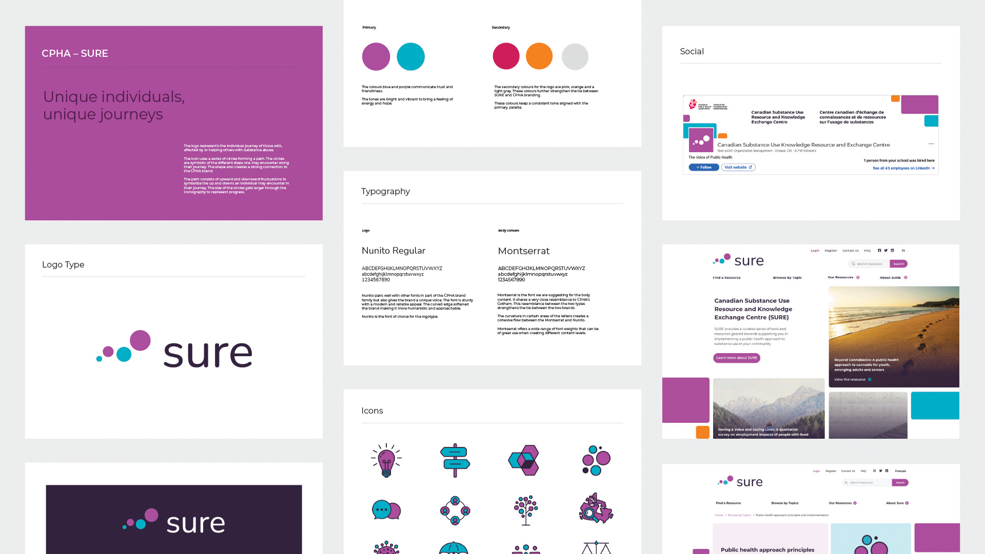
We created a logo which captures the individual journeys of those who affected or those helping and supporting others with substance use. The logotype consists of four circles grouped in a path. The circles represent the steps/progression one may encounter on their journey. The alignment of the circles creates upwards and downwards fluctuations to represent the ups and downs that are experienced along the journey. The size of the circles become larger throughout the grouping, this really helps convey that no matter the ups and downs along the journey the journey leads to progress.
When conceptualizing the visual design of the website it was imperative that the brand values that were established in the creation of the logo be clearly communicated on the website. Through the use of various design elements such as colour, typography and the use of space. The website displays a strong sense of knowledge expertise and leadership while being approachable and trustworthy to it’s users.

The topic icons that were created as part of the brand further extend the overall strong brand presence established. The icons use a bold linear border which make the icons strong and sturdy, this instills reliability and confidence. The round edges and use of circle shapes throughout the icons maintain a sense of approachability and friendliness all while creating a strong tie to the logo created.