Part of the visual design challenge with Coach Canada was figuring out how to communicate their brand values and their brand tones in a way that is modern, dynamic and engaging all while following their established and limited brand guideline.
We achieved the end result by focusing on using the limitations as guidance instead of treating them as barriers. By doing so, we create a website that communicates the brands tones and values all while creating a compelling and dynamic look and feel which keeps the user engaged.
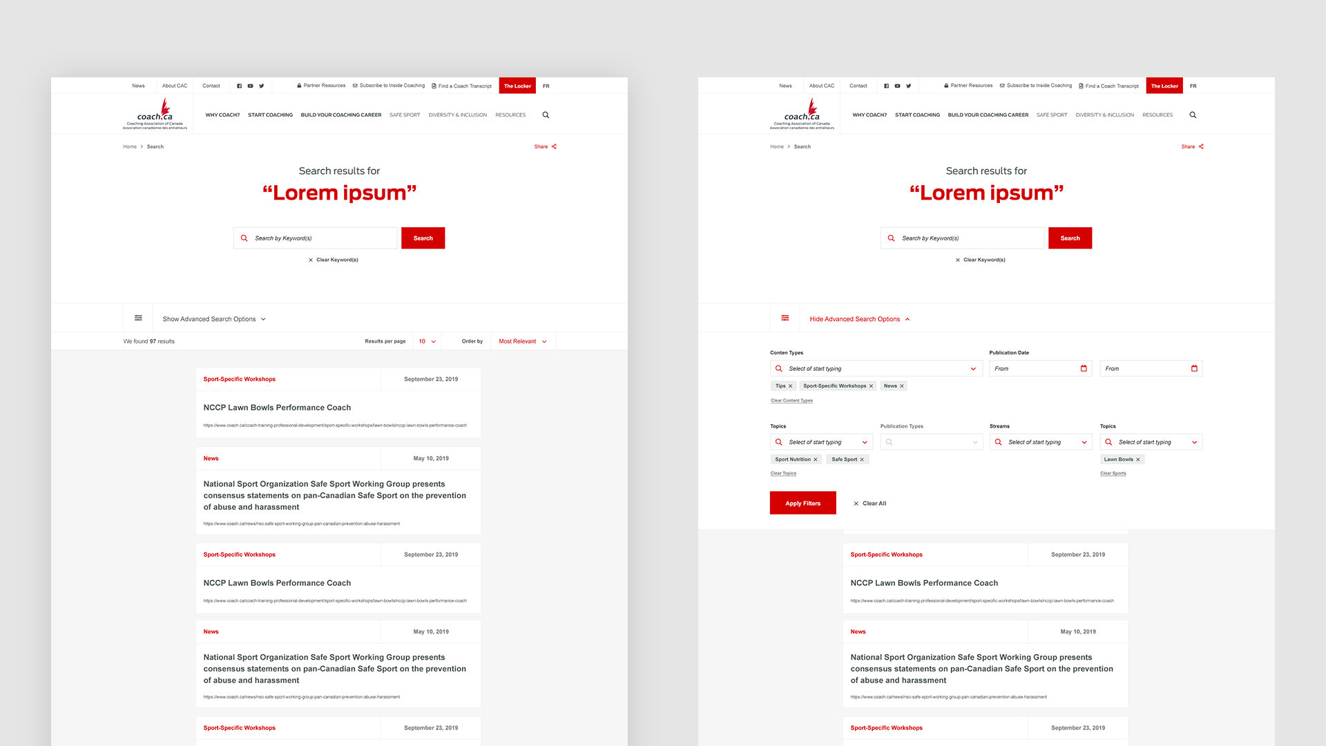
To ensure the red colour met contrast compliance, we were able to slightly modify the tones to ensure the colours meet a AA contrast standard while maintaining its vibrancy.
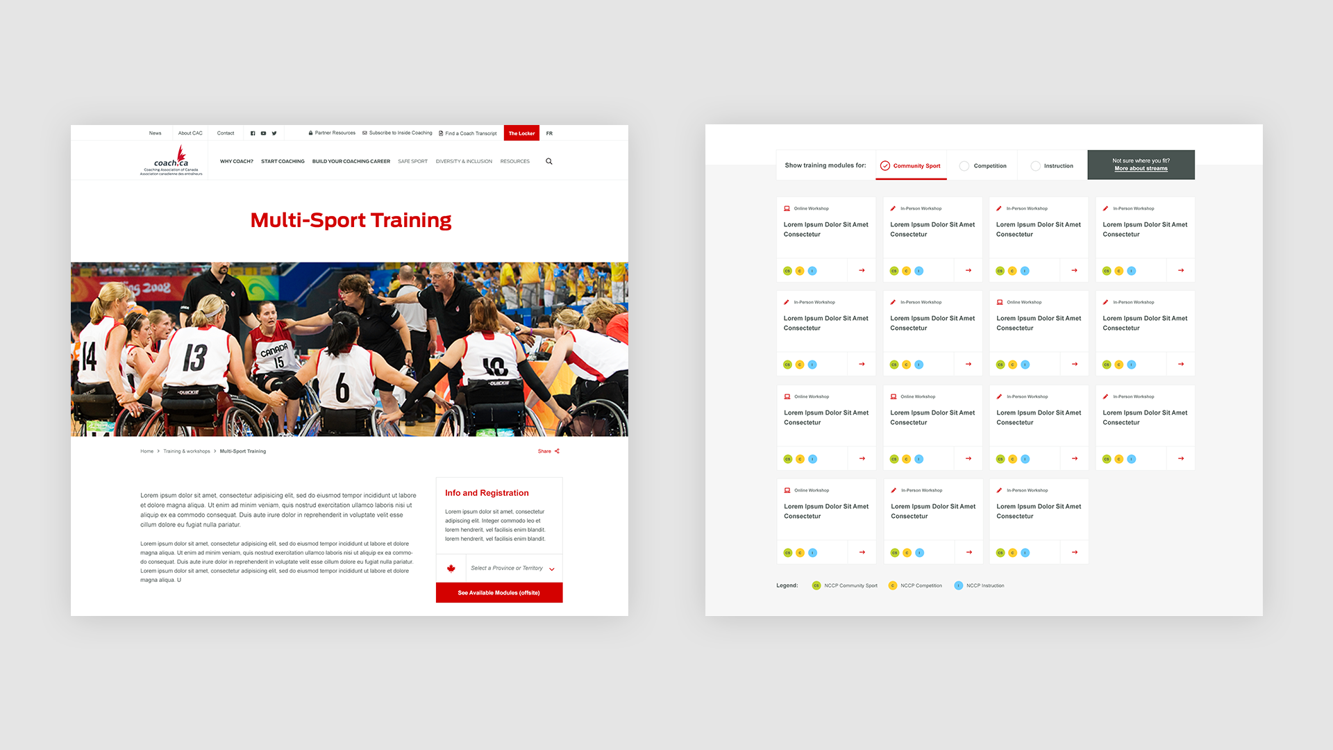
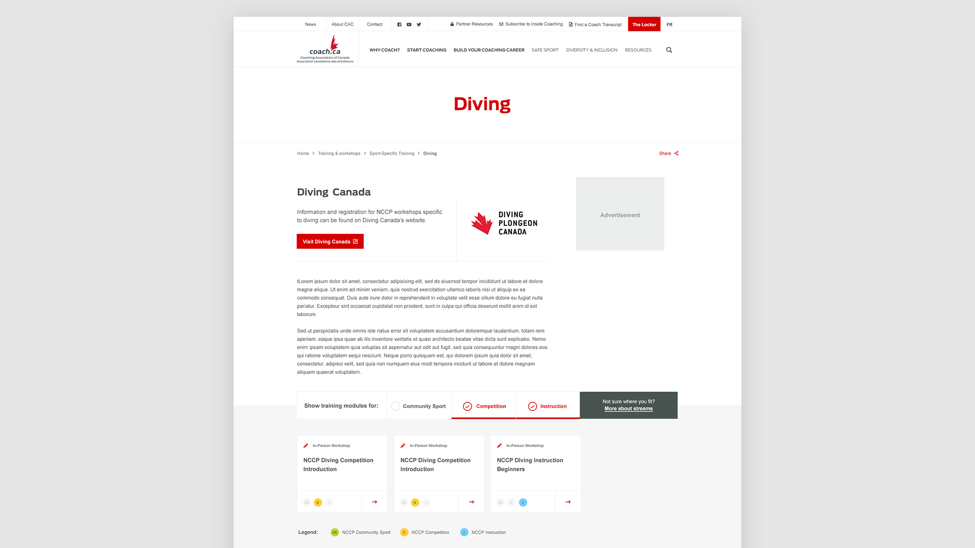
The use of the brand’s secondary colour can be found in the labels on each of their different sports streams. By attributing a specific colour to each stream, the user will be able to recognize the stream label with ease as they navigate throughout the site. To ensure best accessibility practices, each stream label also consists of the title acronym to ensure there’s more than just a colour differentiator.